
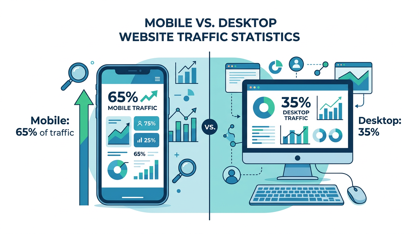
More than 65% of website traffic now comes from smartphones. If your business website was built without mobile users in mind, you’re not just losing visitors — you’re losing customers to competitors whose sites actually work on a phone.
Mobile-first design isn’t a trend. It’s the baseline expectation in 2026. Google ranks mobile experience as a primary factor in search results. Customers bounce in seconds if a site is hard to navigate on a small screen. And for local service businesses and aesthetic practices, where most leads come from a “near me” search done on the go, a bad mobile experience directly costs you bookings.
This guide walks through exactly what mobile-first design means, why it matters for your business, and the practical steps to get it right — whether you’re building a new site or improving an existing one.
What Is Mobile-First Design?
Mobile-first design is a development approach where a website is designed and built for mobile screens first, then adapted and expanded for larger screens like tablets and desktops. It’s the opposite of the traditional approach, where desktop sites were designed first and mobile was an afterthought.
The shift happened because mobile usage overtook desktop around 2015 — and it’s only accelerated since. But more importantly, Google made it official policy in 2021 with mobile-first indexing: Google now primarily uses the mobile version of your website for ranking and indexing purposes.
That means if your mobile site is broken, slow, or hard to use, it doesn’t matter how polished your desktop site is. Your search rankings will suffer regardless.
Mobile-First vs Responsive Design
These terms are often confused, and the distinction matters:
| Mobile-First | Responsive (Desktop-First) | |
|---|---|---|
| Starting point | Mobile layout designed first | Desktop layout designed first |
| Scaling | Expands up to larger screens | Shrinks down to smaller screens |
| Performance | Optimized for mobile loading | Can be heavier on mobile |
| Google ranking | Fully aligned with mobile indexing | May create mobile gaps |
| User experience | Native on mobile, great on desktop | Can feel like a squeezed desktop |
A responsive site adjusts to screen size. A mobile-first site is actually built for mobile as the primary experience. For most small businesses today, the difference in real-world performance is significant.
Why Mobile Matters More Than You Think
The numbers aren’t subtle:
- 65%+ of web traffic globally comes from mobile devices
- 76% of people who search for a nearby business on their phone visit within 24 hours
- 53% of mobile users abandon a site that takes more than 3 seconds to load
- Mobile searchers convert 1.8x more often than desktop searchers when they find what they need
- Google’s Core Web Vitals — which directly affect rankings — are measured on mobile
For local service businesses in Southwest Florida, the stakes are even higher. Someone searching “HVAC repair Cape Coral” or “med spa Fort Myers” at 2pm on their phone is a hot lead right now. If your site loads slowly, the buttons are too small to tap, or the phone number isn’t clickable — they’re calling your competitor instead.
For aesthetic practices, the same logic applies. A prospective patient researching Botox or body contouring is likely doing it during a lunch break on their phone. That research phase is your opportunity to make an impression. A clunky mobile experience communicates carelessness before they’ve even contacted you.
The 6 Elements of Effective Mobile-First Design
Getting mobile-first right isn’t about making things smaller. It’s about making deliberate choices that serve users on small screens, then scaling those choices up.
1. Speed as a Feature
Mobile users are often on cellular connections with variable bandwidth. Speed is non-negotiable.
Google recommends pages load in under 2.5 seconds (Largest Contentful Paint). Every second of delay reduces conversions by approximately 7%. The fastest sites in any industry win a disproportionate share of traffic.
What kills mobile speed:
- Unoptimized images (the biggest culprit — more on this below)
- Too many third-party scripts (chat widgets, pixel tracking, etc.)
- Render-blocking JavaScript
- Poor hosting infrastructure
- No caching or CDN in place
What helps:
- WebP or AVIF image formats instead of PNG/JPEG
- Lazy loading for images below the fold
- Minimizing CSS and JavaScript
- Using a CDN (content delivery network)
- Fast hosting with servers close to your users
A practical first step: run your site through Google’s PageSpeed Insights (free). It gives you a score and specific recommendations. Anything below 70 on mobile is a problem worth fixing.
2. Touch-Friendly Navigation and Buttons
Fingers are not cursors. A link that’s easy to click with a mouse can be nearly impossible to tap accurately with a thumb. Mobile-first design accounts for this from the start.
The rules:
- Tap targets (buttons, links, nav items) should be at least 44×44 pixels
- Buttons should have clear visual weight — bold, padded, and contrast against the background
- Navigation menus should use a hamburger menu or bottom nav bar, not a crowded header
- Don’t put two tappable elements too close together — fat-finger errors frustrate users and drive them away
- Phone numbers should always be clickable-to-call links (
tel:links)
For businesses where conversions happen via a phone call or booking button, this is critical. A “Book Now” button that’s easy to find and tap on a phone will outperform the fanciest desktop design every time.
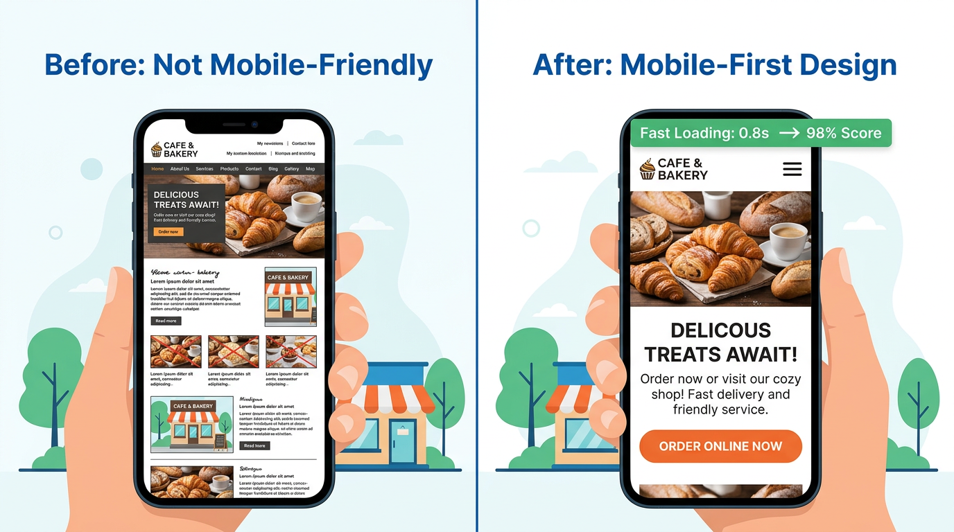
3. Readable Text Without Zooming
If visitors have to pinch-and-zoom to read your content, you’ve already lost them. Mobile-first design means text is legible at native size.
Guidelines:
- Minimum 16px body font size (many designers use 18px for service businesses)
- High contrast between text and background (WCAG AA standard: 4.5:1 ratio)
- Line height of 1.5–1.6x for body copy
- Short paragraphs — 2-3 sentences per block maximum
- Generous white space between sections
For aesthetics practices, where you’re trying to project professionalism and sophistication, readable typography is part of your brand. For local service businesses, legibility builds immediate trust.
4. Streamlined Content Hierarchy
Desktop sites can have more content on screen at once. Mobile sites can’t — and shouldn’t try. Effective mobile-first content hierarchy means:
- The most important thing (who you are, what you do, how to contact you) is visible immediately, no scrolling required
- Secondary information follows in clear, scannable sections
- CTAs (calls to action) appear early and repeat naturally throughout the page
- Forms are simplified — fewer fields, larger inputs, auto-fill enabled
- Long content is organized with clear headings so users can scan
Think about what a customer needs to know to take action: What does this business do? Is it near me? Can I trust them? How do I contact them? Mobile-first design answers those questions before anything else.
5. Mobile-Optimized Images
Images are the primary cause of slow mobile pages — and also essential for conveying quality and trust. The answer isn’t fewer images; it’s smarter images.
Best practices:
- Use modern formats: WebP files are 25-35% smaller than equivalent JPEGs with the same quality
- Serve appropriately sized images for each screen — a mobile screen doesn’t need a 2400px wide image
- Use
srcsetattributes to serve different sizes based on device - Compress images before upload — aim for under 200KB per image
- Don’t skip alt text — it helps SEO and is required for accessibility
For aesthetic practices, before/after galleries are often the deciding factor for prospective patients. If your gallery loads slowly or displays poorly on a phone, it’s actively costing you consultations. The before/after gallery best practices guide covers this in detail for practices.
6. Local Mobile Signals
Mobile search and local search are deeply intertwined. When someone searches for a service on their phone, Google defaults to showing local results — Maps listings, nearby businesses, location-specific results.
Combining mobile-first design with local SEO signals amplifies both:
- Add
LocalBusinessschema markup to help Google understand your service area - Ensure your address, phone, and hours are prominently displayed and structured correctly
- Embed a Google Maps widget so visitors can get directions without leaving your site
- Make sure your Google Business Profile is complete and consistent with your website data
- Use city-specific page content for the areas you serve (Naples, Fort Myers, Cape Coral, Bonita Springs)
Your Google Business Profile optimization feeds directly into mobile search visibility. A well-optimized profile + a fast mobile site is a powerful combination for local lead capture.
The Mobile-First Audit: 5 Things to Check Today
You don’t need to rebuild your site to identify and fix the biggest problems. Start here:
Check 1: Google’s Mobile-Friendly Test
Go to search.google.com/test/mobile-friendly, enter your URL, and get an instant pass/fail with specific issues flagged. This is Google telling you directly whether your site meets its mobile standards.
Check 2: PageSpeed Insights Score
Run your homepage through pagespeed.web.dev. Look specifically at the Mobile tab. A score under 70 means speed is hurting your rankings and conversions. The report will tell you exactly what to fix.
Check 3: The Thumb Test
Open your site on your own phone. Try to:
- Read the main content without zooming
- Tap your phone number
- Find and click the main call-to-action button
- Navigate to a secondary page
If any of these feel awkward or require precision tapping, your visitors are experiencing the same friction.
Check 4: Load Time on Cellular
Turn off Wi-Fi on your phone and load your site on cellular. The difference from Wi-Fi is often dramatic. If it takes more than 3 seconds, you’re losing customers every day.
Check 5: Form Usability
If you have a contact form, fill it out on your phone. Are the input fields easy to tap? Does the keyboard cover the form? Can you submit without frustration? A hard-to-use mobile form is a broken lead capture system.
Common Mobile Design Mistakes Small Businesses Make
Even well-intentioned websites fall into these traps:
Popups on mobile. A full-screen popup on a phone is one of the most frustrating user experiences that exists. Google actively penalizes sites that use intrusive interstitials on mobile. If you’re using a popup for lead capture, make sure it’s dismissible, appears at the right time (not immediately on landing), and doesn’t cover all the content.
Auto-playing video with sound. Phones are often used in public places. Auto-playing video startles users and is a trust-killer. Use video strategically, muted by default, with clear play controls.
Tiny checkboxes and radio buttons. These are almost impossible to tap accurately on a phone. If you have forms with these elements, increase the tap target size significantly.
No click-to-call. If your phone number is just plain text, you’re adding friction to the most valuable conversion action for most local businesses. Every phone number on your site should be a tel: link.
Social proof buried below the fold. Reviews and testimonials are convincing — but only if visitors see them. On mobile, most users don’t scroll as far as on desktop. Put your strongest social proof signals high on the page. The social proof marketing guide has specific placement strategies that work.
Desktop-heavy navigation. A full horizontal nav bar doesn’t work on mobile. If you haven’t updated your navigation to a mobile menu, it’s likely either cramped or broken on small screens.
Mobile-First and Your Marketing Ecosystem
Mobile design doesn’t exist in isolation. It connects directly to every other marketing channel:
Email marketing: Most emails are opened on mobile. Your email’s landing pages need to be mobile-optimized or the click-through becomes a dead end. If you’re running email marketing automation, mobile-friendly landing pages are essential.
Google Ads and Meta Ads: Paid clicks that land on a slow mobile page waste your ad budget. Before running campaigns, verify your landing pages score well on mobile PageSpeed and have clear, tappable CTAs.
SMS marketing: SMS marketing links open directly in mobile browsers. There is no desktop version of this traffic — 100% of SMS clicks are mobile.
Local SEO: Search rankings, Google Maps listings, and local pack results all prioritize mobile experience signals. A strong mobile site is a prerequisite for local SEO success.
When to Rebuild vs When to Optimize
Not every mobile problem requires a full site rebuild. Here’s a quick framework:
Optimize first if:
- Your site is less than 3 years old
- It’s built on a modern platform (WordPress with a modern theme, Squarespace, Wix)
- Mobile issues are specific (slow images, small text, broken navigation)
- Your budget is under $5K
Consider rebuilding if:
- Your site is 5+ years old and built on an outdated platform
- Multiple mobile audits show systemic failures
- Your conversion rate is well below industry average (under 2% for most service businesses)
- You want to significantly improve performance through a modern framework
Modern website platforms like Astro, Next.js, or SvelteKit are built with performance and mobile-first principles as defaults. If you’re due for a rebuild, choosing the right foundation makes mobile-first much easier to maintain long-term.
What Results to Expect
When small businesses fix serious mobile problems, the results are consistent:
- Organic traffic increases as Google re-evaluates mobile performance scores
- Bounce rate drops as users can actually navigate and read the content
- Conversion rate improves as contact forms and booking buttons become easier to use
- Time on site increases as content becomes more readable and engaging
- Local search rankings improve as mobile Core Web Vitals scores rise
These aren’t overnight changes — SEO results from technical improvements typically take 4–8 weeks to fully materialize. But the underlying business impact (more calls, more bookings, more leads) can often be seen within weeks of launch.
Frequently Asked Questions
Does my site need to be rebuilt from scratch to be mobile-friendly?
Not necessarily. In many cases, targeted improvements — compressing images, increasing font sizes, fixing navigation menus, adding click-to-call links — can dramatically improve mobile experience without a full rebuild. Run a mobile-friendly test and PageSpeed audit first to identify what actually needs fixing.
How do I know if mobile design is hurting my business right now?
Check your Google Analytics data (or Google Search Console) for mobile-specific metrics: mobile bounce rate, mobile conversion rate, and mobile organic traffic trends. If mobile bounce rate is over 70% or mobile conversions are significantly lower than desktop, mobile design is costing you business.
What’s the fastest single improvement I can make today?
Compress and optimize your images. Unoptimized images are the single most common cause of slow mobile sites. Tools like Squoosh (free) or ShortPixel can reduce image file sizes by 50-80% with no visible quality loss. This alone can improve your PageSpeed score by 10-20 points.
How important is mobile design for medical and aesthetic practices?
Critical. Patients researching aesthetic procedures increasingly do so on smartphones during personal time — commutes, lunch breaks, evenings. A slow or difficult mobile experience signals a lack of attention to detail, which is exactly the wrong impression for a practice that performs precision procedures. HIPAA-compliant contact forms and booking flows also need to work flawlessly on mobile.
Will fixing mobile design help my Google rankings?
Yes. Google’s mobile-first indexing means your mobile site’s performance directly affects your rankings. Improving Core Web Vitals scores on mobile — particularly Largest Contentful Paint, Cumulative Layout Shift, and Interaction to Next Paint — can improve ranking positions for competitive local keywords.
Your website is often the first impression potential customers get of your business. On a phone, that impression forms in 2-3 seconds. Make it count.
If you’re not sure where your mobile experience stands or what to fix first, we’re happy to take a look. At Monsoft Solutions, we build and optimize websites for small businesses and aesthetic practices across Southwest Florida — and mobile performance is always our starting point, not an afterthought.
For more on building a website that actually drives business, explore our guides on landing page optimization, local schema markup, and Google Analytics 4 for small business.