
You’re paying for traffic. People are clicking your ads, finding you on Google, following links from your social posts. They land on your page and then… nothing. They leave. No signup, no purchase, no contact form submission.
The problem isn’t your traffic. It’s your landing page.
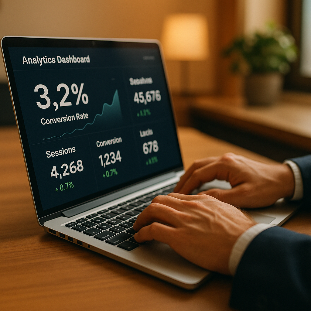
A well-optimized landing page can convert at 5%, 10%, even 20% or higher. A poorly designed one struggles to hit 1%. That’s the difference between a marketing campaign that prints money and one that burns it.
Here’s how to build landing pages that actually work.
Why Most Landing Pages Fail
Before diving into solutions, let’s understand why most landing pages underperform. The issues usually fall into three categories:
Too many choices. When visitors see multiple navigation links, sidebar widgets, and competing calls-to-action, they freeze. Psychologists call this “choice paralysis.” More options don’t help—they hurt.
Unclear value proposition. If someone can’t understand what you’re offering and why it matters within 5 seconds, they’re gone. Most landing pages bury the benefit under corporate jargon or feature lists.
Friction everywhere. Every extra form field, every confusing button label, every slow-loading image creates friction. Friction kills conversions.
The good news? Each of these problems has a clear solution.
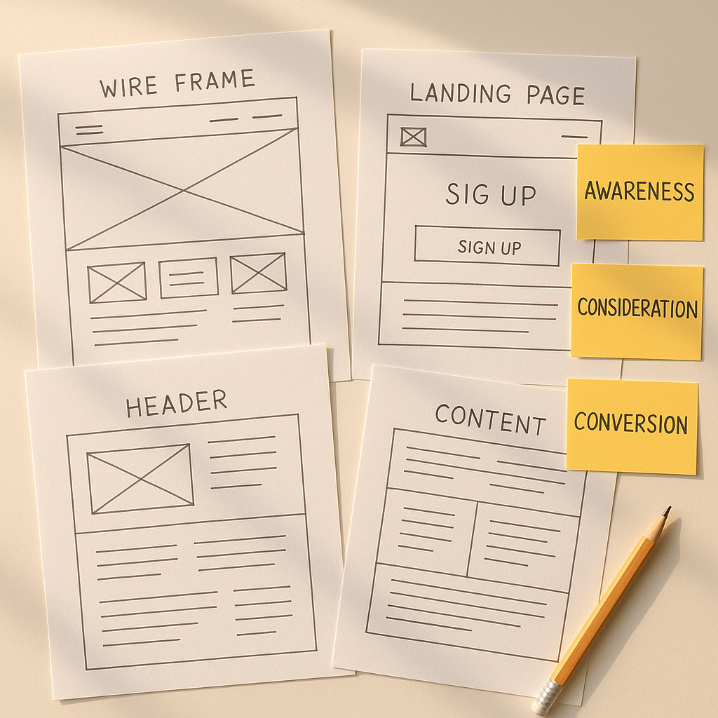
The Anatomy of a High-Converting Landing Page
Every effective landing page shares the same core structure. The details vary by industry and offer, but the framework remains consistent.
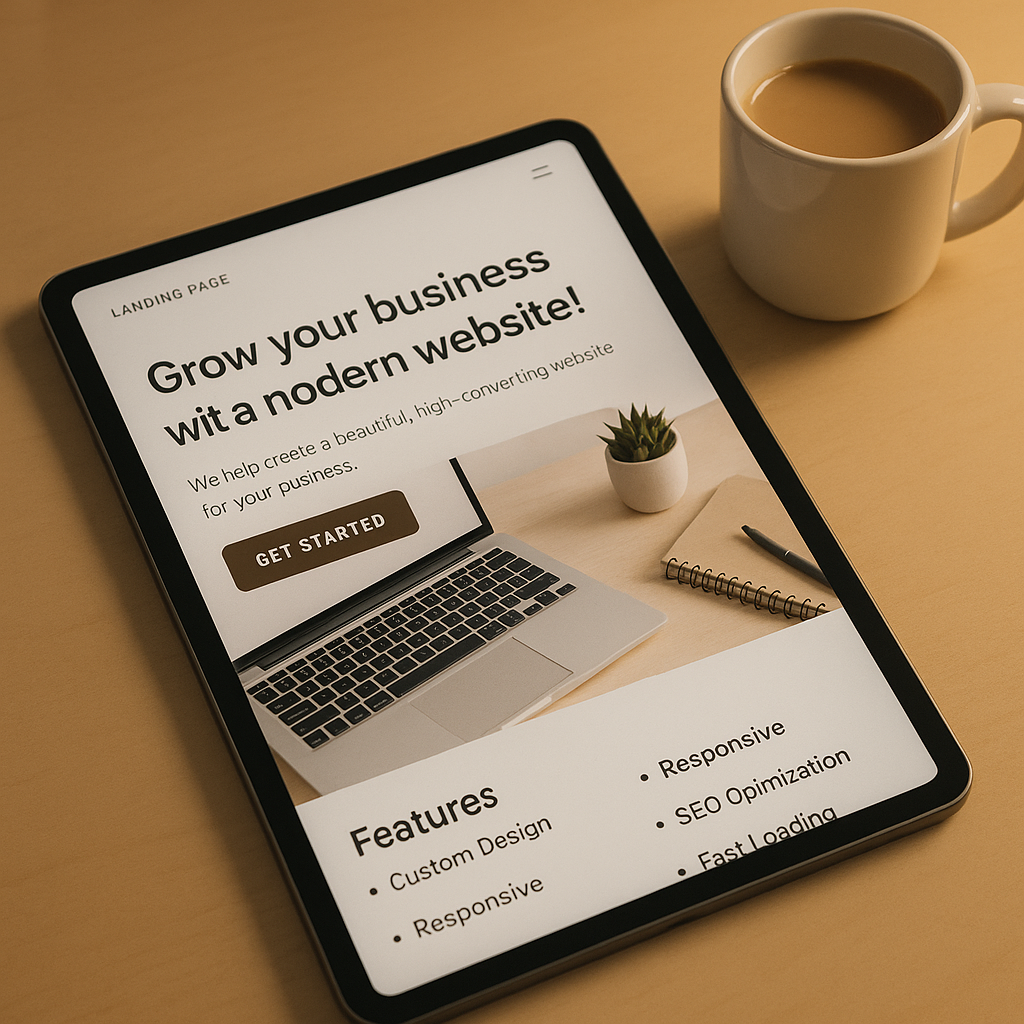
The Hero Section: Your 5-Second Pitch
The hero section—everything visible before scrolling—determines whether visitors stick around. You have roughly 5 seconds to communicate:
- What you offer: Be specific. “Marketing software” says nothing. “Email automation that sends the right message at the right time” says everything.
- Who it’s for: Speak directly to your audience. “For busy small business owners” immediately qualifies (and disqualifies) visitors.
- Why it matters: What’s the outcome? What problem does it solve? Lead with the transformation, not the features.
Hero section formula:
- A clear, benefit-focused headline (8 words or fewer)
- A supporting subheadline that adds context (15-20 words)
- A single, prominent call-to-action button
- A relevant image or video that reinforces the message
Skip the carousel sliders. They’re distracting and nobody watches them. Use one compelling image that shows your product in action or represents the desired outcome.
Social Proof: Build Trust Fast
Visitors are skeptical—and they should be. Everyone claims to have the best product. Social proof cuts through the noise.
Effective social proof includes:
- Customer logos (especially recognizable ones)
- Testimonials with names, photos, and specific results
- Review scores from third-party platforms
- User counts (“Join 10,000+ businesses”)
- Press mentions and awards
Place social proof immediately after your hero section. Before visitors scroll any further, reassure them that others have trusted you—and been glad they did.
Benefits Over Features
Features describe what your product does. Benefits describe what it does for the customer. Always lead with benefits.
Feature: “Automated appointment reminders” Benefit: “Never lose a booking to a no-show again”
Feature: “24/7 AI-powered chat” Benefit: “Capture leads while you sleep”
Structure your benefits section with 3-4 main points. Each should have:
- A clear heading that states the benefit
- A brief description (2-3 sentences)
- An icon or small image for visual variety
The Call-to-Action: Make It Obvious
Your CTA button is where conversions happen—or don’t. Yet most businesses treat it as an afterthought.
CTA best practices:
- Use action language: “Get Started,” “Book My Demo,” “Claim My Free Trial” all beat “Submit” or “Learn More”
- Make it visually distinct: Your CTA should be the most prominent element on the page. Use a contrasting color.
- Repeat it: Include your CTA at least 2-3 times on the page—in the hero, after benefits, and at the bottom
- Reduce friction: Every form field you add reduces conversions. Ask only for what you absolutely need.
For most B2B services, name and email are sufficient to start. You can always gather more information later in the process.
Objection Handling: Answer Before They Ask
Every visitor arrives with objections. Common ones include:
- “Is this too expensive?”
- “Will this work for my specific situation?”
- “What if it doesn’t work?”
- “How long until I see results?”
Address these directly on your landing page. FAQs work well, but you can also weave objection handling throughout your copy.
Pricing concerns: Mention ROI or money-back guarantees Specificity: Include relevant case studies or industry mentions Risk: Highlight free trials, no-commitment options, or satisfaction guarantees Timeline: Set clear expectations about implementation and results
Optimizing for Mobile: Non-Negotiable
More than half of web traffic now comes from mobile devices. If your landing page doesn’t work perfectly on a phone, you’re losing half your potential conversions.
Mobile optimization means:
- Readable text without zooming: 16px minimum for body copy
- Tap-friendly buttons: At least 44x44 pixels
- Single-column layouts: No side-by-side elements that require scrolling
- Fast loading: Under 3 seconds on a typical mobile connection
- Thumb-reachable CTAs: Important buttons should be in the natural thumb zone
Test your landing page on actual devices—not just browser simulations. The experience often differs more than you’d expect.
Speed Matters More Than You Think
Page speed directly impacts conversion rates. Google research shows that as page load time increases from 1 second to 5 seconds, the probability of bounce increases by 90%.
Quick wins for faster landing pages:
- Compress images (WebP format offers the best quality-to-size ratio)
- Remove unnecessary scripts and plugins
- Use a content delivery network (CDN)
- Enable browser caching
- Minimize redirects
Aim for a load time under 2 seconds. Use Google’s PageSpeed Insights to identify specific bottlenecks.
Testing: The Only Way to Know What Works
Every audience is different. What works for one business might fail for another. The only way to know what resonates with your visitors is to test.
Start with these high-impact tests:
- Headlines: Test different value propositions and phrasings
- CTA button text: Try action-oriented variations
- Form length: Compare fewer fields vs. more qualified leads
- Social proof placement: Above or below the fold?
- Hero image: Product shots vs. outcome imagery
Run A/B tests for at least 2-4 weeks to gather statistically significant data. Tools like Google Optimize (free) or VWO make this straightforward.
Common Mistakes to Avoid
Sending all traffic to your homepage. Your homepage serves multiple purposes and audiences. Landing pages should be focused on a single offer and a single audience.
Writing for everyone. The more specific your targeting, the higher your conversion rate. A page that speaks to “business owners” will always underperform one that speaks to “dental practice managers in Florida.”
Ignoring above-the-fold. Yes, people scroll. But your hero section still needs to be compelling enough to make them want to scroll.
Adding navigation menus. On a landing page, every link that isn’t your CTA is an exit opportunity. Remove distractions.
Forgetting to follow up. A conversion is just the beginning. What happens after someone fills out your form matters as much as the page itself.
Putting It All Together
Building a high-converting landing page isn’t complicated, but it does require intentionality. Every element should serve one purpose: moving the visitor closer to your goal.
Your landing page checklist:
- Clear, benefit-focused headline visible immediately
- Single, prominent call-to-action
- Social proof early on the page
- Benefits explained in customer terms
- Common objections addressed
- Mobile-optimized and fast-loading
- No unnecessary navigation or distractions
- Form with minimal required fields
Start with one landing page. Measure its performance. Test variations. Improve iteratively. Even small conversion rate improvements compound dramatically over time.
A page that converts at 3% instead of 1% triples your marketing ROI—without spending a single extra dollar on traffic.
Need help building landing pages that convert? We design and develop high-performance websites for small businesses and professional practices. Get in touch to discuss your project.